UC Davis ARC Redesign
A 5-day design challenge to redesign the UC Davis Activities and Recreation Center app, improving accessibility, usability, and functionality. The sprint that got me into Design Interactive.
This was my application to UC Davis Design Interactive, a cohort-based design program. The challenge: redesign the UC Davis ARC (Activities and Recreation Center) app in five days. The goal was to improve its accessibility, usability, and core functionality. In five days I ran surveys, held 2 in-person interviews, completed usability testing, and produced sketches, wireframes, and a polished high-fidelity prototype. It got me into the cohort.
Redesign the ARC app to improve accessibility, usability, and functionality, in 5 days.
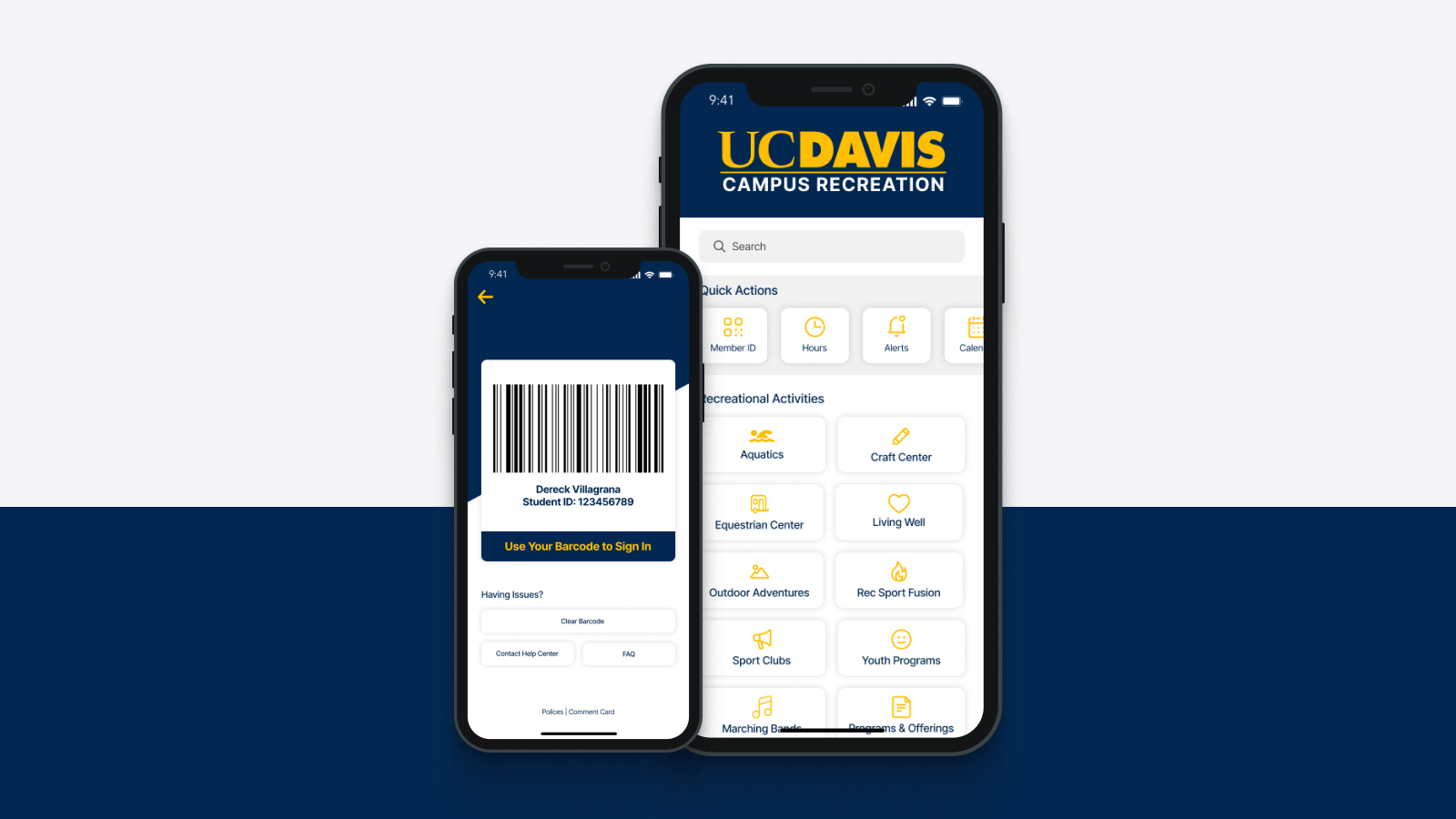
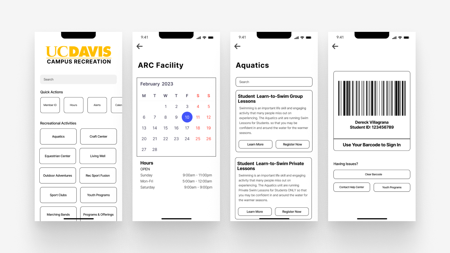
The ARC app lets UC Davis students reserve equipment, book facilities, view class schedules, and manage memberships. The existing app had accessibility shortfalls, navigation patterns that didn't match how students actually used the space, and a visual design that felt dated. The challenge was to address all three in a tight sprint without losing the core utility that students relied on.
Three specific failures, each one costing students time before they even walked in the door.
Most students came to the ARC for one thing: a class or the weight room. Both required 3+ taps from the home screen. The app's structure mapped to the facility's departments, not how students actually moved through the space.
The facility reservation UI used generic date/time pickers that didn't account for ARC-specific rules: 2-hour booking windows, equipment requiring in-person check-out. Errors surfaced at submission, not at input, causing repeated drop-off.
Announcements, class schedules, and reservations were given equal visual weight, with no way to surface what was relevant to a specific student's visit. Everything felt equally important, so nothing did.
White text on light photography throughout the app failed WCAG AA contrast minimums. Core content like class times and booking confirmations was technically unreadable for users with low vision.
Two in-person interviews, surveys, usability testing, then design, all in five days.
I front-loaded the research as much as five days allowed. Two in-person interviews with active ARC users gave me qualitative grounding. A quick survey filled in gaps. Usability testing on the existing app surfaced the exact points where students got stuck. Then: sketches, wireframes, high-fidelity prototype.
Wireframes: restructured navigation and booking flow
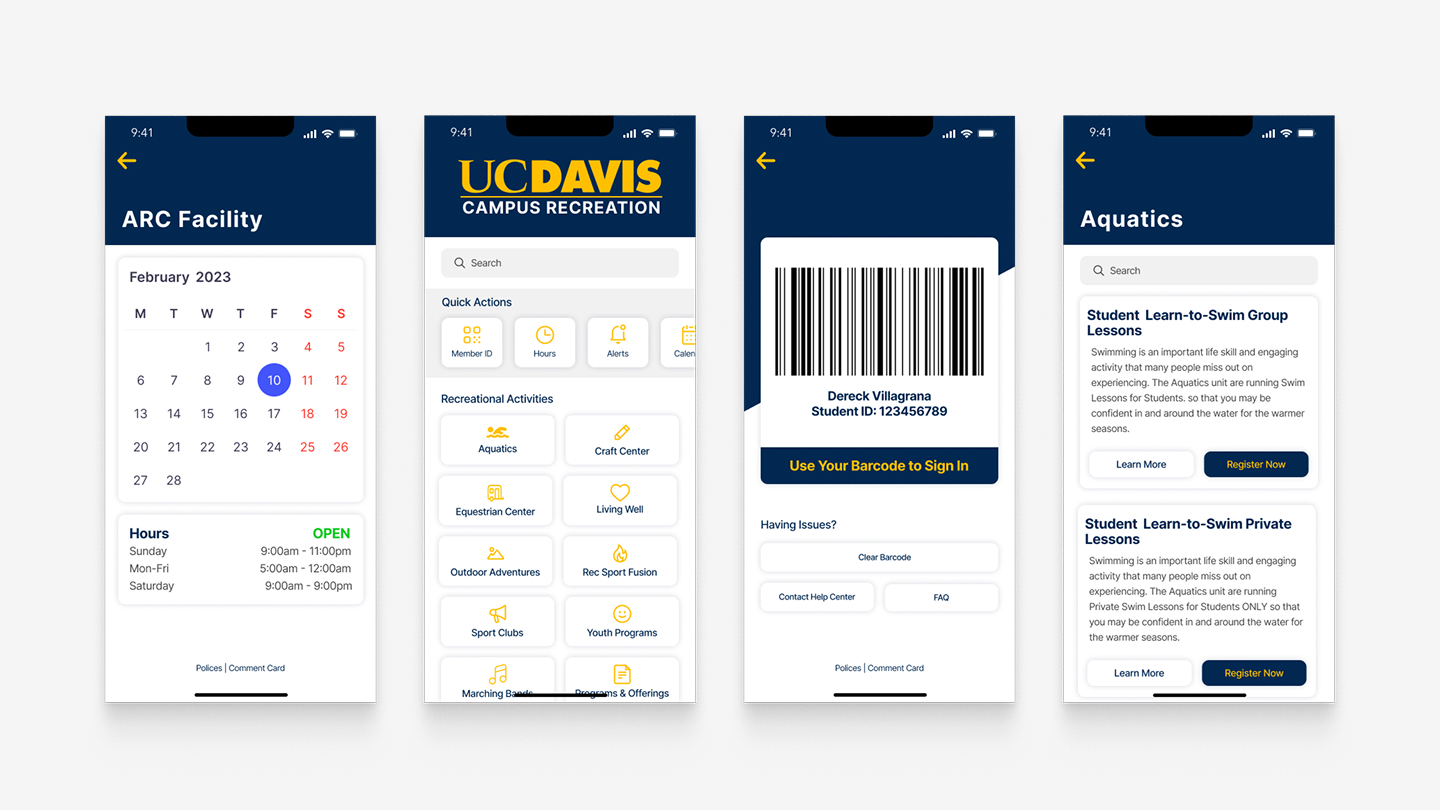
Final high-fidelity prototype: redesigned class schedule, equipment booking, and facility reservation
Restructure around intent, not departments.
Navigation built around visit intent
Instead of organizing by facility department, I restructured the home screen around why students came to the ARC in the first place: "I'm here to work out," "I'm here for a class," "I'm here to reserve." Three clear entry points replaced the original tab structure, collapsing 3+ taps into one.
ARC-aware booking widget
Replaced the generic date/time picker with a purpose-built booking widget that surfaced real-time availability and enforced ARC-specific rules at the input level, not at submission. If a slot wasn't available or a rule would be violated, it was made visible before the user tried to book, not after.
Accessibility as a constraint, not a checkbox
Applied WCAG AA contrast minimums to every text-on-image treatment, which meant rethinking how the app used photography as a background. The redesign kept the visual energy of the original while making core content readable for everyone.
It got me in, and it taught me that scope is a design decision.
The prototype placed well enough to earn a Design Interactive cohort spot. More than the result, the sprint clarified something I now apply to every project: in five days you can't solve everything, so the design problem becomes a prioritization problem first.
Deciding which friction to remove, and being honest about which to leave, turned out to be the real skill being tested. The navigation restructure and booking widget had the most direct impact on the problems students actually hit. The visual refresh mattered, but it was the third priority, not the first. Learning to make that call under pressure is something I've carried into every project since.