Body Sculpture Aesthetics
Sculpting Beauty: Artistry Meets Advanced Aesthetics. I designed a homepage for a body sculpting clinic with almost no brief, a reference that didn't resolve, and a four-week deadline.
Body Sculpture Aesthetics is a non-invasive body sculpting clinic built around luxury, professionalism, and results. They needed a homepage that could attract new clients, showcase their services, and position them as a trusted name in aesthetics. The client provided two things: a black and white logo and a single reference link to a site in the same industry, which no longer resolved. With almost nothing to work from and a hard deadline, I had to define the visual identity, establish the design direction, and deliver a finished Figma handoff and Webflow build within four weeks.
What does a premium aesthetics clinic look like online when you have to figure that out yourself?
The brief was nearly nonexistent. The client communicated through emails spaced so far apart that building any real momentum was difficult. What they gave me was a black and white logo and one reference link. The link no longer worked by the time I tried to access it.
That left me with almost every design decision to make independently. Getting the direction wrong meant burning time I didn't have. The core question I had to answer on my own: what does a premium, non-invasive aesthetics clinic look like online, and how do you communicate trust and results to someone who's never heard of this business?
Starting from one asset and building everything outward.
Starting from the logo
The only concrete asset I had was a black and white logo. Rather than treat that as a limitation, I used it as a starting point. A monochrome base suggested either a minimal light palette or a dark, editorial direction. Given the industry, dark felt more premium. I decided to build the color system around that logo, pairing black with gold accents to push it into luxury territory without losing the clean, clinical feel aesthetics clients expect.
Competitor research and visual reference
With no working reference from the client, I did my own. I looked at competitors and reference sites across the aesthetics and beauty clinic space to understand what visual patterns high-end clinics use and where most sites fall short.
A few patterns stood out: luxury aesthetics brands tend to use dark backgrounds with gold or champagne accents to signal premium positioning. The strongest sites led with the outcome (how you'll feel and look) rather than a list of services. Real photography of treatments builds more trust than abstract imagery or generic stock.
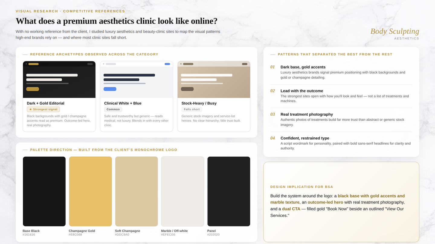
Visual research: competitor sites and luxury aesthetics brand references
Design decisions in Figma
I moved into Figma once I had a visual direction locked. Key decisions:
Color. Black base with gold accents and marble texture to communicate luxury without feeling cold.
Typography. The client's script wordmark carried a high-end, personal feel. I paired it with bold sans-serif headlines to stay legible and confident across the page.
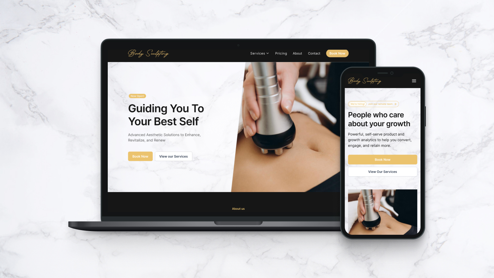
Hero. Led with a real treatment photograph and the line "Guiding You To Your Best Self" to immediately communicate the outcome, not the service list.
CTAs. Dual call-to-action structure with a primary "Book Now" (filled gold) and secondary "View Our Services" (outlined) to serve both high-intent and exploratory visitors.
Desktop and mobile, designed in parallel.
The client requested both a desktop and a mobile screen, so I designed both in parallel to make sure the layout held across breakpoints.
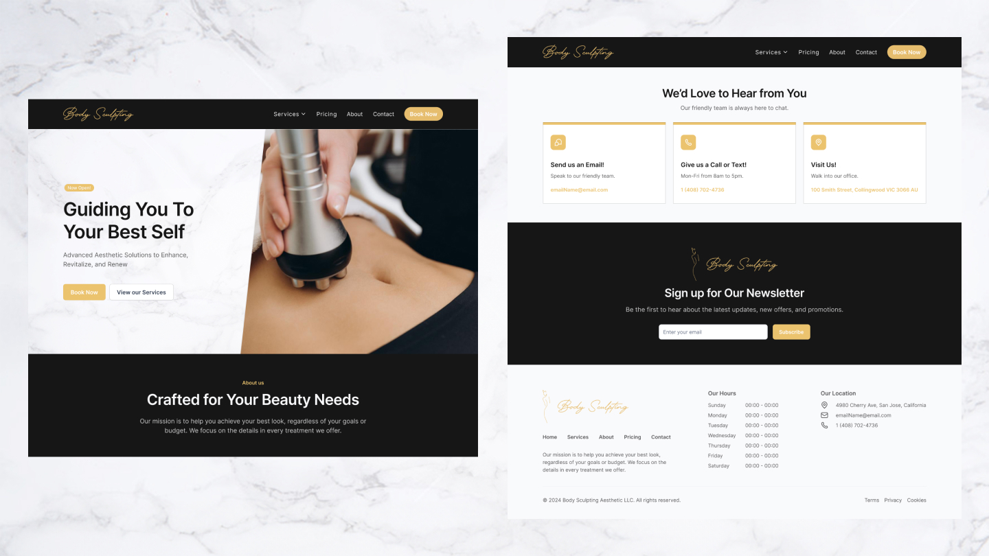
Desktop homepage: hero, services, and CTAs
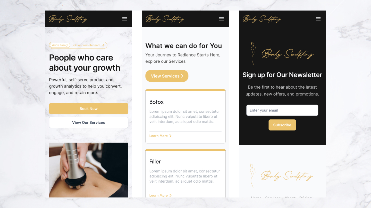
Mobile homepage: adapted layout for smaller screens
Working without a brief teaches you to write your own.
The logo was the only brand anchor I had. Using it as a starting point rather than a constraint meant I could build a full visual direction from a single asset. That's a skill I didn't know I had until I needed it.
Communication gaps are a design constraint too. Sparse client feedback meant I had to be more deliberate about what I presented and when. Every touchpoint needed to carry more weight because there weren't many of them.
Scope clarity matters as much as design quality. A four-week freelance timeline with limited back-and-forth taught me to separate decisions that genuinely needed client sign-off from ones I could own independently. That distinction kept the project on track and on time.