SnapPlant
A plant identification app with an awareness angle around deforestation and invasive species. It was the first time I owned the full UX process end-to-end with a real deadline.
A three-week final project for my UI/UX design course. The app helps users identify plants around them, with the broader goal of raising awareness around deforestation and invasive species. I ran surveys, conducted usability testing, and built the full design pipeline solo: research, ideation sketches, wireframes, and high-fidelity screens. This was one of the first times I owned the full UX process end-to-end with a real deadline.
Plant identification as a vehicle for environmental awareness.
Most plant ID apps stop at identification. SnapPlant's intention was to go further, connecting users to information about deforestation rates in their region and whether the plant they just identified is native or invasive. Knowing the plant is one thing. Knowing what it means for the ecosystem around you is another.
People are curious about plants. They're not curious about deforestation, until you make it local.
Most survey respondents could name plants by their common name but had no idea whether they were native, invasive, or at risk. Environmental knowledge stopped at recognition.
Apps like PictureThis and iNaturalist excelled at identification but stopped there. Once users had a name, there was no obvious next step: no context, no consequence, no reason to care.
Deforestation felt distant and global in surveys. When reframed locally ("this species is displacing native plants within 10 miles of you"), engagement in concept testing jumped significantly.
The moment of curiosity, pointing your phone at something and wanting to know what it is, was the right place to introduce context. That window of attention is real and brief. Design for it.
Research, sketch, wireframe, prototype: solo, three weeks.
I started with user surveys to understand how people currently interact with the plants around them and what barriers exist to environmental awareness. Usability testing informed iterations before the final high-fidelity screens were produced.
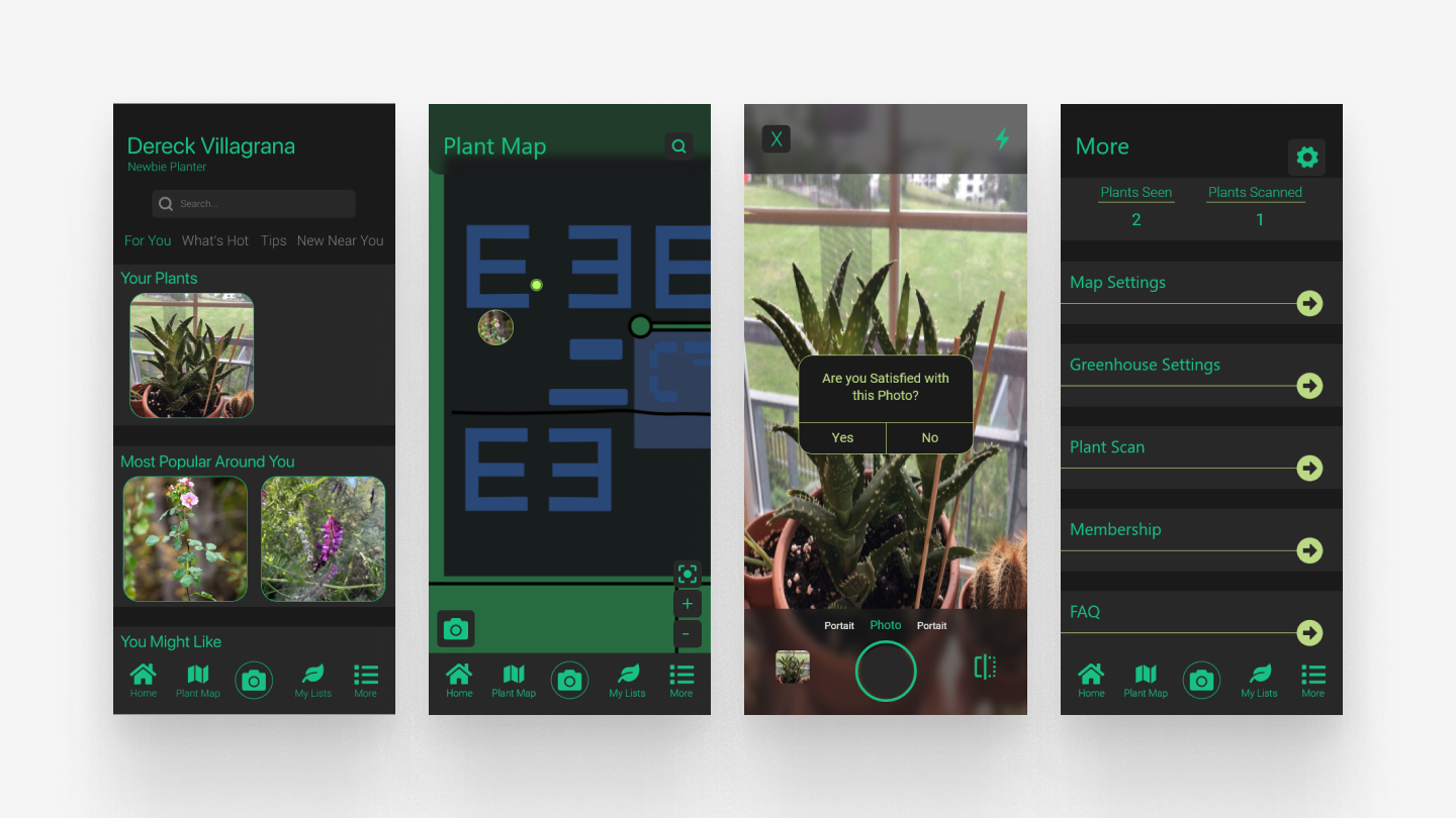
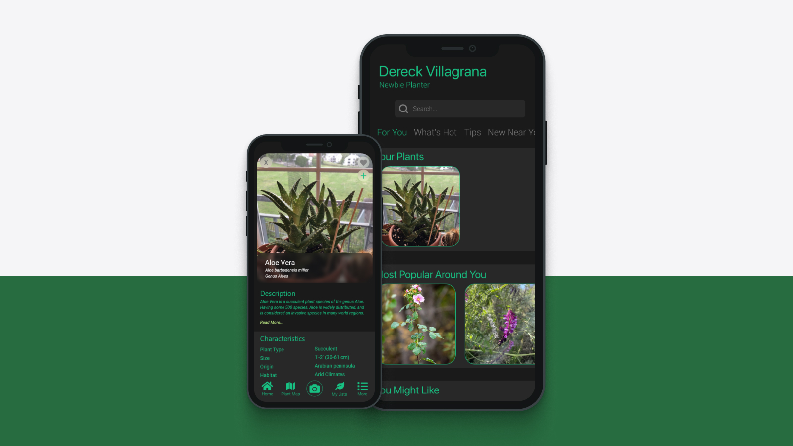
Final high-fidelity screens: plant ID, results, and environmental context
Make identification feel instant. Make awareness feel optional, but worth it.
Speed as a design principle
The identification flow was designed to feel instant, camera to match in under 3 seconds, so users didn't lose the moment of curiosity before anything useful appeared. If the result took too long, the window closed.
Awareness as opt-in, not interruption
The environmental context (deforestation data, invasive species information) appeared as a secondary card after the identification result, not in place of it. Identification always worked cleanly first. The awareness layer rewarded users who wanted to go further without alienating users who just wanted a name.
Visual tone: calm, not alarming
The subject matter (invasive species, deforestation rates) could easily read as preachy or anxiety-inducing. The visual design leaned into greens, off-whites, and generous whitespace deliberately. The goal was to inform without overwhelming. A calm interface made the information feel approachable rather than urgent.
Solo end-to-end work teaches you what you actually believe about design.
Running the full process alone, with no team to defer to and no one else's research to lean on, compressed my decision-making in a way that's hard to replicate in group projects. Every call was mine. That pressure clarified what I actually believed about the design versus what I was just guessing at.
The biggest thing I learned: restraint is a choice, not a default. It would have been easy to layer in more features: social sharing, gamification, streak counters. Each one would have made the app more complex and less itself. The version that shipped was simple because I actively decided to keep it that way, not because I ran out of time.