Sonidos del Alma Danzante
Sounds of the Dancing Souls: a full brand identity for a conceptual Cumbia music festival rooted in East Los Angeles, from naming and research through logo, brand system, and a Jarritos co-brand.
Sonidos del Alma Danzante, "Sounds of the Dancing Souls," is a conceptual Cumbia music festival set in East Los Angeles. Built across two UC Davis courses, this project was a full brand identity from the ground up: naming, research, creative brief, logo, brand guidelines, marketing materials, merchandise, and a Jarritos co-brand. East Los Angeles is one of the most predominantly Latino communities in the country. Cumbia, born on Colombia's Caribbean coast and now deeply woven into Mexican and Latin American identity, felt like the right fit for the place and the people.
Before sketching anything, I spent time understanding what Cumbia actually is.
This project was personal. I'm Mexican. I wanted to do it right.
Not just surface-level. The real history. Cumbia originated on Colombia's Caribbean coast as an African courtship dance, blending African, Indigenous, and European influences over centuries. By the 1940s it had arrived in Mexico, evolving into distinct regional subgenres: cumbia sonidera, chicha, cumbia norteña, cumbia andina.
I also looked at the demographic reality of the location. East Los Angeles is 96.7% Latino. Maywood is 96.4%. Boyle Heights is 94.0%. This wasn't a festival being parachuted into a neighborhood. It was meant to belong to it.
Visual research included imagery from Mexican pottery, Aztec tiles, traditional dresses, musicians, dancers, and the visual language of East LA itself.
Ten names. One that felt complete.
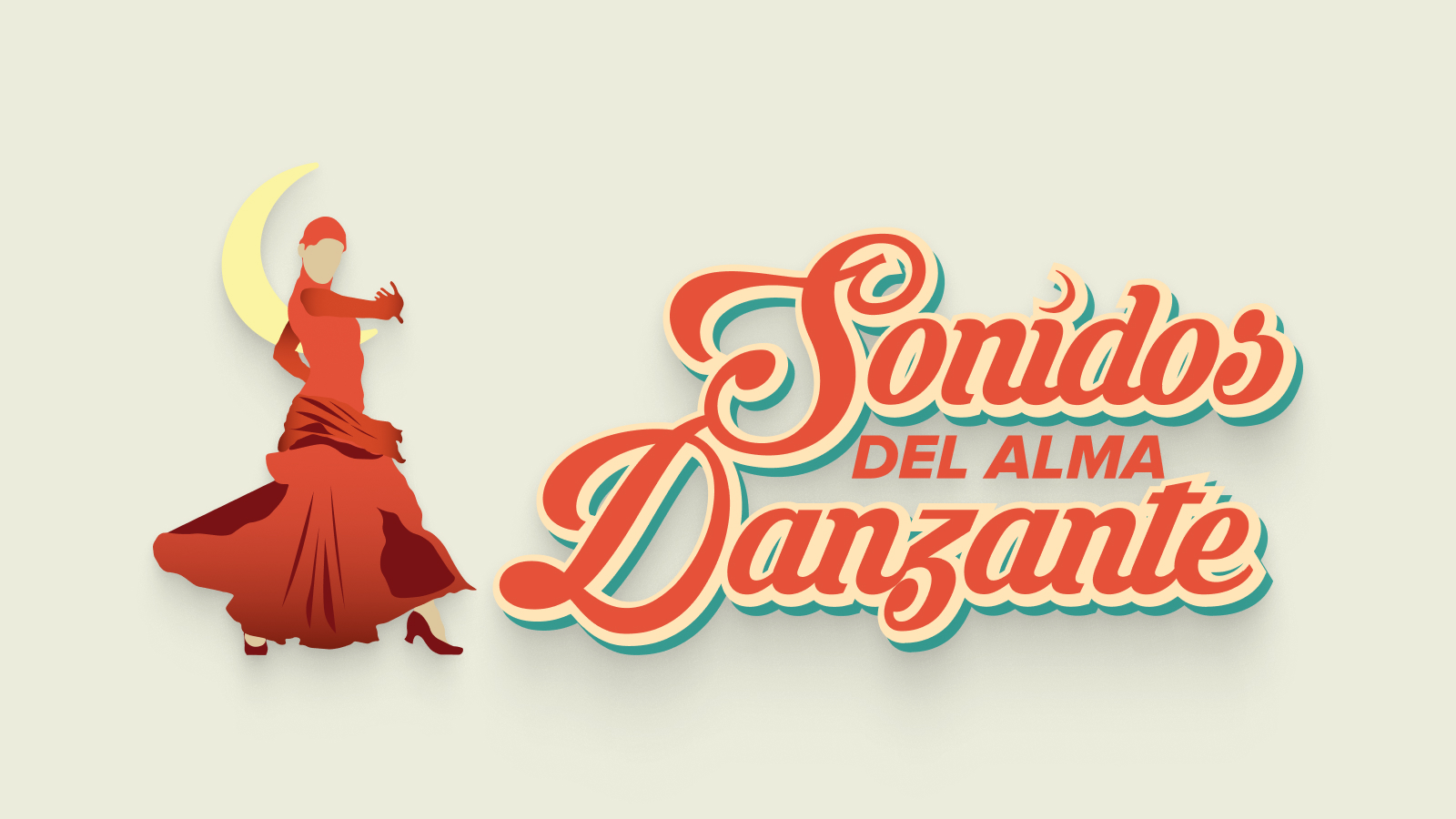
I went through ten potential names before landing on the final one. "Sonidos del Alma Danzante" felt complete: it captured movement, soul, and sound in a single phrase. "Sounds of the Dancing Souls" was evocative without being literal, and it carried the spiritual energy that Cumbia, at its best, actually produces on a dance floor.
Many variations. The final one only works because of what didn't.
The logo was where I got the most stuck. Getting the letterforms, the weight, and the cultural feeling to all work together took longer than any other part of this project. The final logo balances a bold, hand-lettered quality that nods to Latin design traditions with enough structure to work across all applications.
Logo exploration process: early iterations and refinements
Final logo system: primary, secondary, and third variations with clearspace rules
Three colors. Each chosen to reflect something real about the festival.
A fiery red-orange representing the raw energy and heat of Cumbia on a dance floor. Primary color at 60% use.
A warm golden tone evoking the lively, open atmosphere of the festival and the sun-soaked character of East LA. Secondary at 30% use.
A deep teal representing depth and cultural diversity. Accent color at 10% use.
Lemon Milk for display: wide, bold, all-caps, energetic. Plus Jakarta Sans for body text, clean and legible, balancing Lemon Milk's expressiveness.
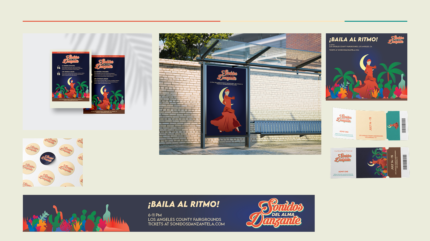
Marketing materials: festival poster, digital posts, and event signage
Jarritos: not a random pick.
For DES 144, I extended the project into co-branding territory and chose Jarritos. Founded in 1950, Jarritos is one of the most recognizable Mexican soft drink brands in the world, a fixture at quinceañeras, family gatherings, street food stands, and community events. It's not just a soda. It's part of the cultural fabric.
Pairing Sonidos del Alma Danzante with Jarritos felt honest. Both celebrate Mexican and Latin culture. Both belong in East LA. The co-branded festival kit covered beverages, food, and clothing, the two brands sharing visual space naturally because their personalities and values were already aligned.

Co-branded festival kit: beverages, food, and merchandise
Research isn't just preparation for design. It is part of the design.
Understanding Cumbia's history, how it traveled from Colombia's Caribbean coast through Mexico and Peru and into the streets of East LA, informed every visual decision I made. The colors, the energy, the name, the choice of Jarritos. None of those were arbitrary. They came from actually learning what the culture is and what it means to the people who live it.
The honest reflection is that I could have gone deeper. I'm Mexican. This is my culture. And I still felt like I was only scratching the surface. Jarritos and the colors are real parts of the culture, but what actually makes the culture the culture is something harder to put on a poster: the sense of community, the way music creates belonging, the fact that Cumbia isn't just listened to. It's danced to, together, in circles.
If I did this again, I'd spend the first week doing nothing but talking to people in East LA about what this festival would mean to them before I ever opened Illustrator.